
More flexible Shopify layouts: Shogun content builder basics and custom elements

Hello, I'm engineer Kawashima.
While Shopify can be customized in a variety of ways with just the theme editor, coding expertise is usually essential to adding features that don’t exist on the theme and making significant customizations on the design side.
However, Shopify offers a number of apps that support customization.
In this article, one of them: Shogun is a content builder app I will introduce it.
Using Shogun, you can create pages intuitively without coding and also use coding to customize them in more detail :)
Contents [ hidden display ]
About Shogun
Shogun is a content builder that allows you to create and edit pages simply by dragging and dropping elements on the screen, and it’s available for EC platforms like Shopify or BIGCOMMERCE.
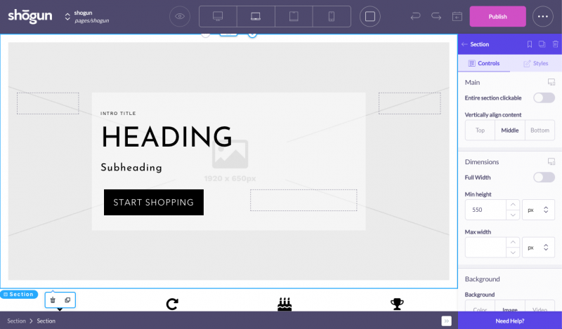
Editor's Edit Screen
There are three pricing plans (in the case of Shopify) and you can also use page analysis or AB testing for higher-level plans.
The cheapest Build plan ($39/month) is enough to build a page, but you need a Measure plan ($99/month) or higher to take advantage of the custom elements described later.
For basic usage of Shogun, please refer to the following article.
https://www.s-bokan.com/blog/post-18810/
And Shogun, official document There’s a lot of GIF-based instructional explanation, so please check it out and see what you need to know.
The official quickstart guide is here. Yes.
element that can be arranged in Shogun
Elements that can be placed from the Shogun editor as of November 2019 are:
Structure (structure)
It is a box element for placing content, which configures the layout of pages.
- Section
This is the most basic element. First, it's the basic flow of placing a Section and adding content inside it (for those with HTML expertise: name that seems to be confused with the selection element but outputs div elements).
- Columns
It is used when building parallel layouts of two or more columns.
- Slider
Place the slider, and you can customize your slider's appearance as well, but it is not possible to set the number of seconds to switch or thumbnail display.
- Table
Place the table, you can add rows and columns from the sidebar.
- Tabs
Place areas where you can switch tabs, and adjust the layout in a relatively detailed way, such as tab title or border look.
- Accordion
Places an area where accordion expansion is possible, you can adjust the appearance but not animation action at the time of accordion expansion.
Contents (content elements)
The following can be arranged as content elements:
- Image
Place the image, you can adjust transparency and hover-time behavior as well as modalize individual images with Lightbox option.
- Video
You can embed videos by setting the URL of Youtube or Vimeo.
- Heading
Place the heading, it will be output as H1-H6 and you can set the detail of the heading.
- Text
Place the text and it will be output as a p element on HTML.
- Button
You can adjust the language and color in a button, or set the link destination.
- Icon
Place the icon. FontAwesome There are various types of icons that can be embedded.
- Countdown
Place the countdown timer. It seems to be compatible with a limited-time campaign page :)
- Separator
Place the border.
- Form
Place the form. The input field in the form can be selected from a text, email and text area. Other elements are currently under development: If you cannot meet your requirements with Shogun’s form element, it is better to add an embeddable form created by external third-party apps within the HTML description element described below.
- Map
Place a Google Map, and the location displayed in Google Maps is typed from the sidebar.
- HTML
Place an HTML description area that can be used to add custom CSS and JavaScript, or as a place for writing embedded code.
Shogun More Powered by Custom Elements
As I’ve mentioned above, Shogun lets you place a variety of elements in the page, but if you want to customize them to more detail, it might be inconvenient for you to adjust your slider’s animation or even make an in-screen central alignment on Shogun alone.
The original custom element is useful for that.
The Measure plan ($99/month) or higher contract requires knowledge of Liquid/HTML/CSS/Javascript, but once you create a custom element it's easy to drag and drop them into the same place as an ordinary Shogun element.
Basic page creation is done on Shogun, and if you have a cooperative system where engineers implement complex parts with custom elements, you can create more design and original pages in Shogun.
METHOD FOR DESCRIPTING Custom ELEMENT
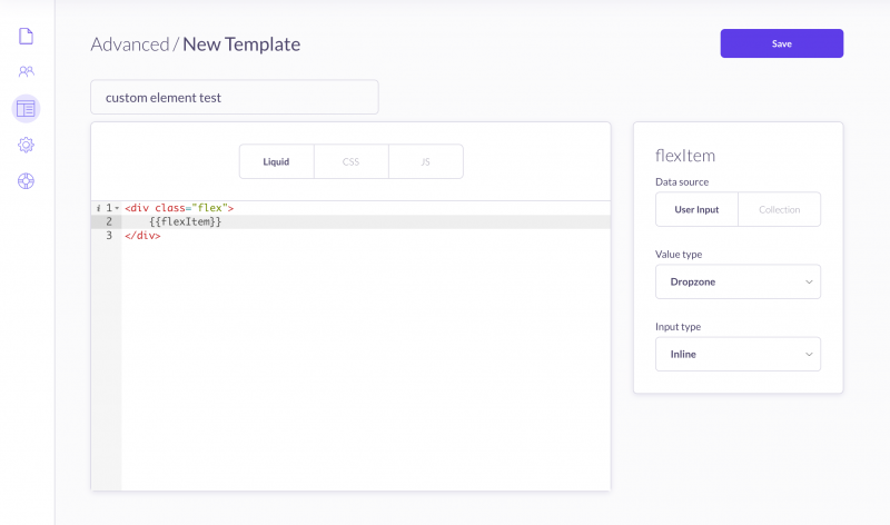
shogun's custom element description screen
For custom elements, you can write a Liquid variable (the {{flexItem}} part of the Liquid tab in the capture above) to edit settings for use in the Shogun editor.
Editable items are as follows.
- Datasource
Determines whether the content to place in a variable location should be placed from the Shogun screen (User Input) or selected from the data collection.
- Value Type
Define the type of content you want to place in your edit. the details of each type are official documents. If you want to drag and drop content from the Shogun editor, select Dropzone.
- Input Type
The input method of the content to be placed at an edited place is set as either sidebar (Sidebar), multiple lists (Multi) or inline (Inline).
The basic usage of custom elements is explained in detail in the official documentation.
Recent updates increase the number of images and make it easier to understand:)
- Creating Custom Elements with Liquid, CSS and JS How to make custom elements
- Custom Elements Documentation : Specification details of custom elements
Custom Element Description Sample
This time, I tried to create a custom element that is very simple in-screen center arrangement up and down.
The contents of each description are as follows.
The example describes CSS as a custom element, but you can just keep it in Liquid and apply the Shopify theme's CSS.
<!-- カスタム要素Liquidタブの記述内容 -->
<div class="shgCustom-flex">
    {{flexItem}}
</div>
/* カスタム要素CSSタブの記述内容 */
.shgCustom-flex {
display:flex;
align-items: center;
justify-content: center;
width: 100%;
height: 100vh;
}
.shgCustom-flex > * {
width: 100%;
}If you place this custom element, and then put the Button element of Shogun in {{flexItem}} part, the actual output DOM will be as follows.
<div id="(ハッシュ値が出力されます)" class="shg-c  (※後述:Custom cssで設定したclass値はここに出力されます)">
  <div class="shgCustom-flex">
    <div id="(ハッシュ値が出力されます)-btn-wrapper" class="shg-c shg-btn-wrapper  shg-align-center">
      <a id="(ハッシュ値が出力されます)" class="shg-btn shg-cse " href="">Text</a>
    </div>
  </div>
</div>
Supplementary: Custom CSS class specification
Unlike custom elements, you can also edit your Custom CSS settings in the Shogun editor and add a class value that will be output to the Shogun element.
For the class output position of Custom CSS, see DOM sample above: Output location cannot be changed.
Since the Shogun element is basically outputted surrounded by div, it is better to use custom elements for layouts (e. g. CSS flexbox) that include the specification of a direct child element.
instead
Shopify offers a number of themes, including free and paid ones.There is an environment that makes it easy to build e-commerce sites with excellent design.
However, if you’re obsessed with branding, customizing the theme layout is still essential.
Try to create different layout pages using the Shogun app :)