Design for Non-Designers, Part 3: Behind the Scenes and Simple Tips Worth Knowing

In the final episode, “Introduction to Design for Non-Designers,” we will show you the behind-the-scenes and a little bit of tips on design. Here are some of the reasons why art director Sato has come up with each design while looking at the site where he designed it.
Contents [ hidden display ]
introduction of an example
Japanese Language Learning Site
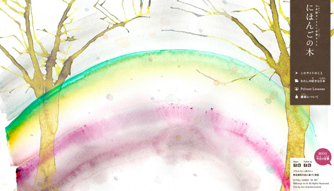
The project started with consultation to create a site for learning Japanese, and the concept was “a site that can help make learning Japanese fun.
The purpose of this site is to make it possible for students to apply for private lessons in Japanese, but there was a story that it would be difficult to increase the number of students because clients do it alone. In addition, I thought that the most important thing so that visitors can receive information properly when starting such business is "to become fans of this site".
And when I thought about how to become a fan, I thought that we should be able to convey our clients' thoughts and stances on Japanese language education through some kind of "experience" even in a short time.
So when I launched the site, we created a mechanism that matched sounds to make leaves stick to trees. We looked at them as leaves = verbal leaves. Some clients say “learning foreign languages is like growing trees,” and they used wood as their motif (this word is taken from Japanese ginseng tree). about this site. It’s a wonderful feeling) so you can impress your clients with the experience.
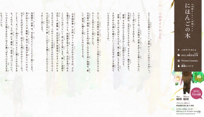
In addition, this site has become a rare vertical writing on the website to get in touch with Japanese culture. The main visual used for the background is expressed by an artist so that both the painting touch and color will be some kind of Japanese atmosphere.
For a few seconds, I’ve opened up the site with quiet music and leaves to make my stories feel like they are “good” or something.. Facebook also wanted me to press Likes for more fans.
walmide coffee
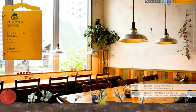
This shop is a cafe where customers come from far away, even though it is not easy to go without the business of Saigoku branch temple station on the Chuo Line. The concept of this store is "a cafe for children" so that you can enjoy this wonderful space by sitting together in your father's lap and having fun with them." Even if it is for kids, the store space is so particular that high quality things such as water washers are used, I wanted to make a site where you could touch something really good firstly.
Next, I wanted to convey it properly because there is a firm philosophy, so in order to express that philosophy, I took the bold method of circulating video which was written like a letter written by the owner during site loading at first.
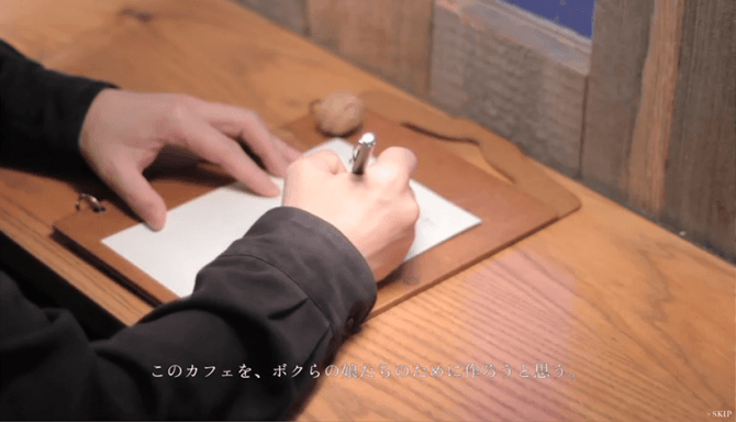
When you go to the top page of a site, squirrels, which are icons for shops, appear as stories of adventures in stores; along the way, walnuts and apples that were motifs from restaurants also fell down, and we made tricks like throwing them with mouse drag.
I thought that if we communicated the space and the way of thinking in a shop, there would be an increase in fans, so I made it conscious to do design work so as not only to convey information easily understandable but also to convey the atmosphere and signs of this store.
Heber House 'Tenku Children's Castle'
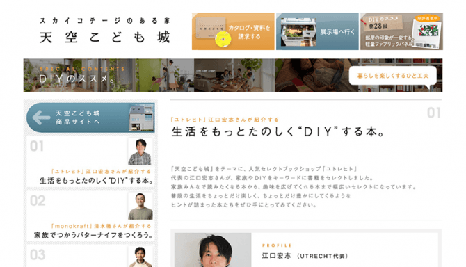
http://www.asahi-kasei.co.jp/hebel/topics/tenku/
Heberhouse's three-story residential product site, which is different from the first two in that it wants you to not only become a fan but also ask for materials. First of all, it tells us about the charm of the third floor space where children and family can play freely (the origin of the name of the sky children castle), so that people who are attracted by this can get information on specific products at the bottom stage.
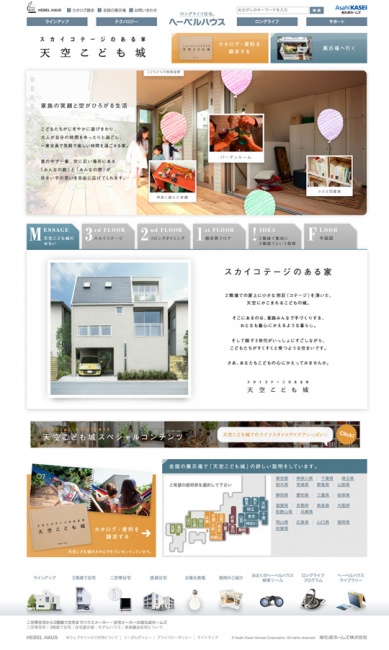
As for the priority of information, first the appeal of products is transmitted and secondly the information that can be accessed by interested people comes to you; also, because there are restrictions on the area that can be displayed in a single screen, the button for requesting materials is installed at two places at the top and bottom of the page so that even small screens can be seen.
zechia
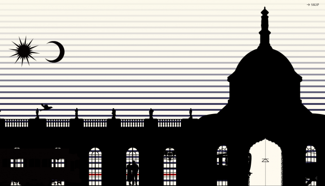
It's an apparel brand site. Clients asked us to accurately convey the image of our brands, rather than explanatory information (such as price for specific goods). The brand concept is "resort", "classic" and "creative." Classical, sometimes referring to European classics, is based on a story about European shadow-like animations entering old castles. We created some strange spaces that look like modern interiors in ancient castles.
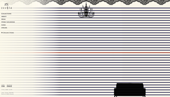
The border is also a brand icon, and I use it as an accent because the original color schemes are tricolour but they’re so colored that we put red at one point. Red is generally said to be eye-catching, so I avoided using them all over because of their eyes-catching colors. At the same time, lace has been used as a shadow painting motif on top of the page due to its distinctive brand elements.
What are the tips for design?
Finally, we will introduce what art director Sato has been saying in the past: “What are you conscious of when designing.
"I'm conscious of seeing them in the eye as much as possible, and it is said that if they think they are ready to be completed at night, then they should wake up in the morning and look again. That means a little bit more from someone else's perspective; I think it's important to have an awareness that you can understand because you don't know what other people will do as well as you may not know.
In addition, as a professional, originality may be necessary but it is important to communicate in an easy-to-understand manner first, and I think that originality can be done afterward. I am thinking that the originality is something that comes out without being conscious of it, so we are designing it."
How was the "introduction to design for non-designers" introduced three times?Design may have an impression as a field of sense and talent, but it is also something that can be used by everyone with just a little knowledge along with other techniques. Design is about having imagination and compassion in your eyes Sato says, “It may actually be the same thing that is important in any occupation or everyday life. I hope this information will help you in your daily life.”