
Design for Non-Designers, Part 2: Learn Basic Design Principles to Communicate Information Clearly

Introducing Design for Non-Designers" The second article introduces the basic rules of design. If you know it, it may be an axis when something gets lost and I'd like to start right away.
The laws of graphic design have been advocated by various people, but this time we introduce the four basic rules proposed by Robin Williams.
As a prerequisite, the law is not the first one; it has this in common when we analyze things that are easy to understand and beautiful. Here's how to get to an answer quickly, not exactly what you have to do, but something useful to know:
Contents [ hidden display ]
- Four Laws of Graphic Design
- Pre-design: The state of parallelizing character information
- 1: Separate by means of meaning [the law of proximity]
- 2: Arranging makes it easier to understand [the law of alignment]
- 3: Make rules and repeat [the law of repetition]
- 4: Make the highest priority stand out [contrast]
- the arrangement and contrast of elements
- finishing
- finished version
Four Laws of Graphic Design
- law of proximity
- law of alignment
- law of repetition
- law of contrast
Using the design of our company’s blog as an example, we will explain four laws.
Pre-design: The state of parallelizing character information
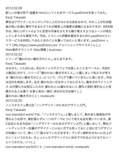
The following is a parallel list of the characters in your blog, and I don't feel like reading them at all.
1: Separate by means of meaning [the law of proximity]
The next step is to divide paragraphs by blog post, and by dividing them (= grouping) we can see that there are three meanings of cohesion, making it a bit easier to see.
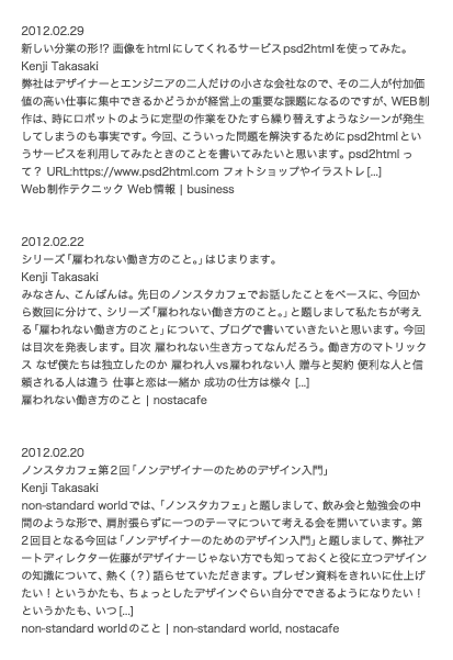
In the following example, grouping (= classification of information) is further meaningful among three groups: The vacancy between large groups (articles), and the vacancy between small groups (dates in an article, text, etc.
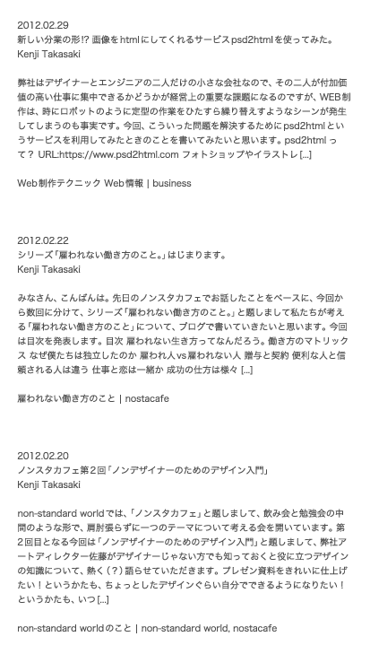
If we approach each other in this way, it looks like a sense of unity. " law of proximity Using this law, we can quickly and accurately communicate information. In addition to creating space like that, there are also applications of grouping, such as drawing and dividing lines or coloring them.
2: Arranging makes it easier to understand [the law of alignment]
The following examples are missing out on the head of a sentence, and there is no rule at all in the marginal vacancy; it's hard to understand its meaning because of extras and irregular vacancy.
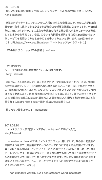
Just by aligning the head of a sentence like this, it became easy to understand at once: This is the second law. law of alignment That's it.
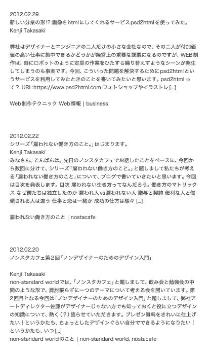
But in this state, there is still no law of how to group or put vacancy into each article; so the third rule "law of repetition" comes into play.
3: Make rules and repeat [the law of repetition]
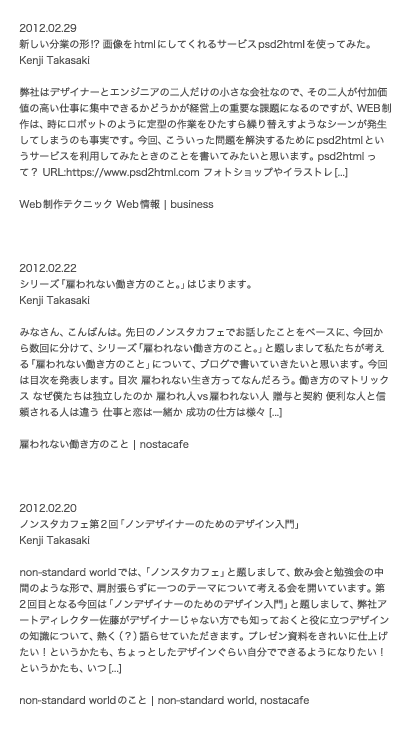
Making rules for each article’s grouping and vacancy, repeating them makes it easier to understand and at the same time creates a pleasant rhythm. law of repetition That's it.
4: Make the highest priority stand out [contrast]
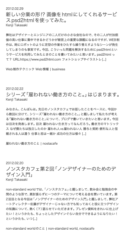
Although the information was organized by "law of proximity", "law of alignment" and "law of repetition," I still have an impression that it is difficult to see the title of the article, which is the most information you want to convey.
So we make the title of an article bigger: when you want to convey meaning more firmly, you need to prioritize your information and contrast it so that you can highlight something with a higher priority.
This is the fourth law: contrast The title of the article, which is the main character, has become easy to see.
the arrangement and contrast of elements
Contrast is relative: for example, you can make a contrast by thinking about how big an article title should be to the text, which means “jump rate of characters.
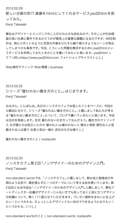
The following two examples (A/B) have the same text size for an article title, but I think B is easier to see because it makes room before and after the article title.
- A -
- B -
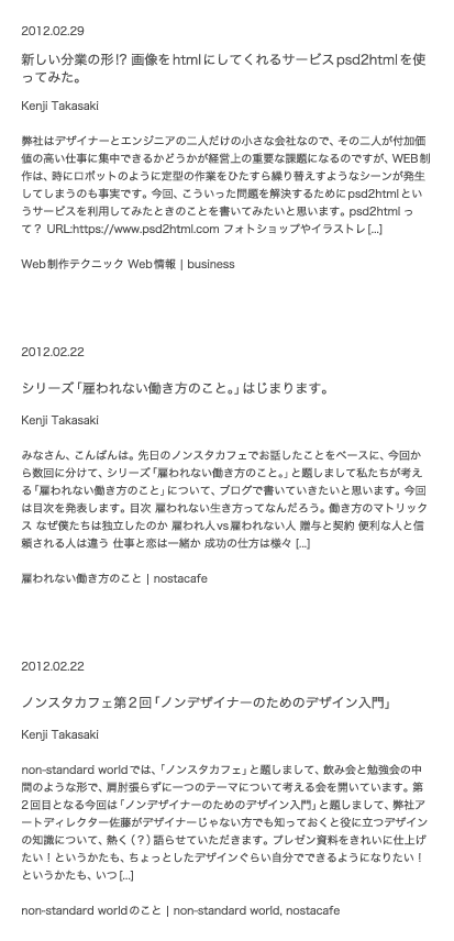
You can see that if you have more space, it will make your eyes easier to notice and on the other hand, if there is less space, you need to increase the jump rate of characters you want to show off.
The proper character jump rate for positioning and contrasting is closely related to both sides, so you can make the information you want to convey visible without having to enlarge it, but that requires a lot of space, unlike paper, because web design in limited space such as monitor screens, there are many situations where you need to be noticeable with the character jump rate.
finishing
I'm about to get into the finishing stage, and I made it a rule to color characters.
The date is gray, the letters are black and the article category has been browned so far.
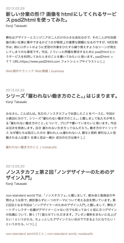
finished version
Here’s what we did with the imagery:Since images are more likely to be transmitted faster than text, our company blog has made it possible for us to include some kind of imagery.
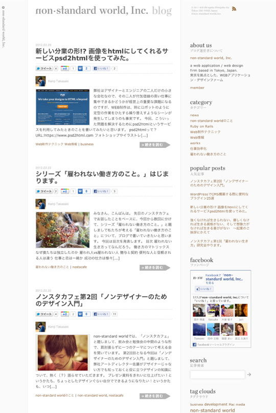
It’s been a long time, but this is an introduction to examples that utilize the basic laws of graphic design. Next time we will introduce actual techniques and little tips while looking at what art director Sato designed in non-standard world so far.
Reference: The Non-Designer's Design Book, Robin Williams, Pearson Education, 1994.