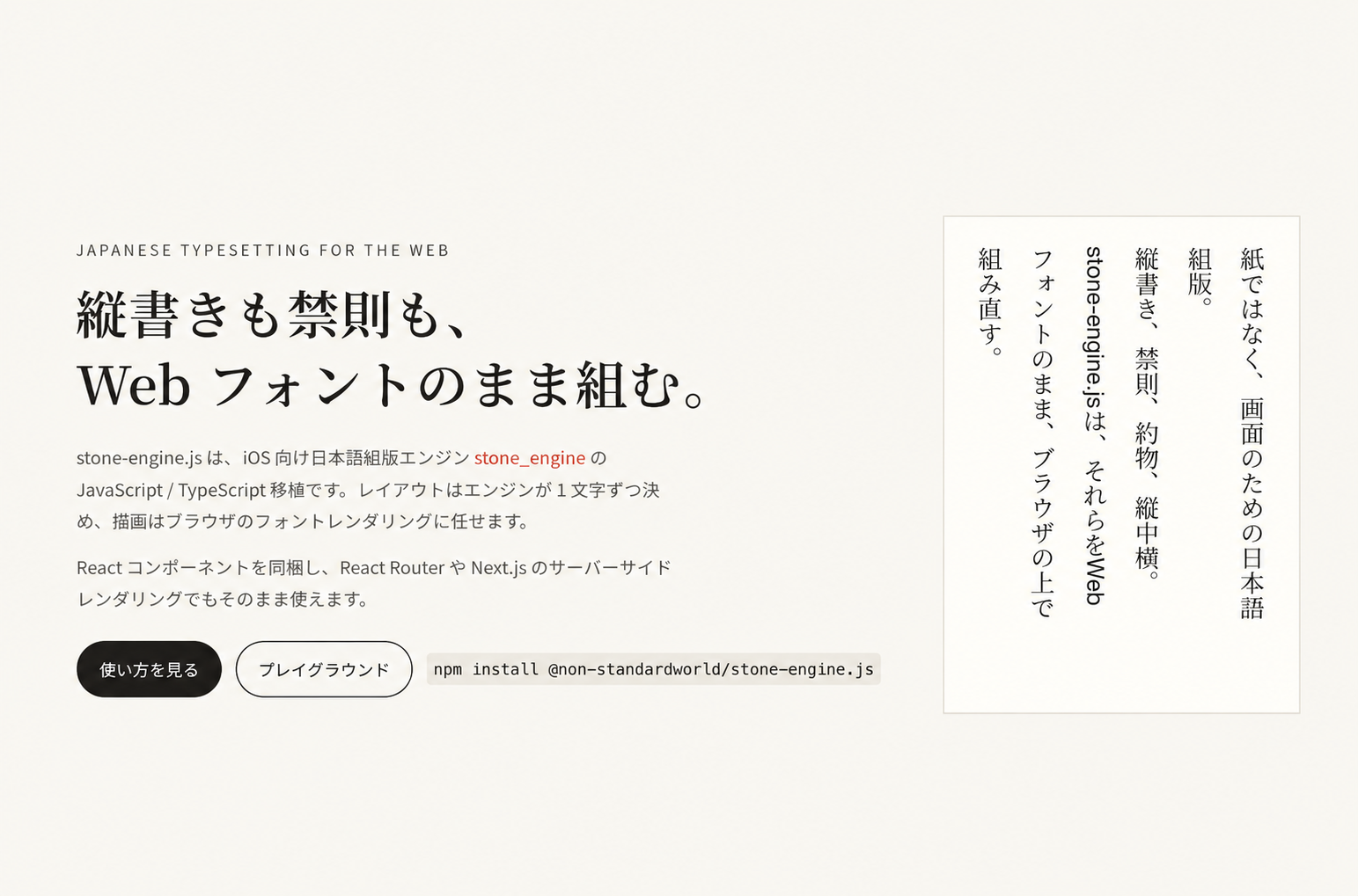
Print-quality Japanese typography for the web. We ported an iOS typesetting engine developed at Nippon Design Center to JavaScript.

We have ported the open-source iOS typesetting engine behind Nippon Design Center’s writing editor, “ stone ”, called “ stone engine ”, to JavaScript as “ stone-engine.js ” to make it widely available on the web.
This brings print-quality Japanese typography to websites built with modern JavaScript frameworks, including vertical writing, Japanese line-breaking rules, and punctuation spacing.
With permission from Nippon Design Center, we are releasing it today as free, open-source software. You can install it with a single command—give it a try.
It is already used on this website and in our own service, “ atelier yori.so ”.
Contents [ hide ]
Features
All the examples are typeset live on this page. Characters turn red on hover because each character is an individual SVG element.
Vertical writing and horizontal text within vertical lines
Numbers of up to two digits remain upright; longer numbers and Latin letters rotate 90 degrees. Punctuation and brackets use glyphs designed for vertical writing.
View code
<StoneText direction="tbRl" height={280} fontSize={18} lineHeightScale={1.9}>
  {"令和6年12月31日、Ver.2.0を公開した。数字は2桁まで縦中横、3桁以上の123と英字は回転する。"}
</StoneText>
Japanese line-breaking rules
Punctuation and closing brackets stay off the start of a line, and opening brackets stay off the end. Strict rules, equivalent to CSS line-break: strict, also keep prolonged sound marks, small kana, full-width exclamation marks, and middle dots off the start of a line. Paired ellipses and dashes are kept together.
View code
// 比べやすいように 1 文字単位で折り返す(dividesByWords={false})
<StoneText width={220} dividesByWords={false} kinsoku>{text}</StoneText>
<StoneText width={220} dividesByWords={false} kinsoku={false}>{text}</StoneText>
Punctuation spacing
Consecutive punctuation and brackets are compressed to half-width spacing. In stone mode, spacing is adjusted only where it looks natural, taking neighboring characters into account.
View code
<StoneText punctuationMode="whole">{text}</StoneText>  // 常に全角
<StoneText punctuationMode="half">{text}</StoneText>   // 常に半角
<StoneText punctuationMode="stone">{text}</StoneText>  // 前後関係で判断(既定)
Fonts and scaling by character type
Specify a separate font and scale for Japanese characters, Latin characters, and emoji. Here, Latin text uses Georgia at 90% scale.
View code
<StoneText
  fonts={{
    japanese: { family: '"Noto Serif JP", serif' },
    latin: { family: "Georgia, serif", scale: 0.9 },
  }}
>
  {"日本語の中に English や 2024 を混ぜても、文字種ごとにフォントとスケールを選べる。"}
</StoneText>
Text alignment
Align text to the start, center, or end, or justify it. Justification distributes extra space evenly between characters, except on the last line and lines ending in an explicit line break. It adds no space within Latin words or between paired ellipses and dashes.
View code
// 余白は文字間に均等に配る。欧文の単語の途中と「……」「——」の間は空けない
<StoneText textAlign="justify" width={300}>{text}</StoneText>
Dashes, ellipses, and quotation marks
Paired ellipses and dashes, double exclamation marks, and reference marks use the Japanese font even after Latin text. In vertical writing, they remain upright and centered in the column. Quotation marks use the Latin font when attached to Latin text and the Japanese font within Japanese text.
View code
// ダーシ・リーダーと「‼」「※」などは欧文の後ろでも和文フォントで組み、縦書きで回転させない。
// 引用符は欧文に付けば欧文、和文中なら和文として組む
<StoneText direction="tbRl" height={280}>
  {"「待って……」と言った——“了解”‼ ※欧文の“Hello”は回転する。"}
</StoneText>
Truncation and ellipses
Lines that exceed the available space in the line-stacking direction—height for horizontal text and width for vertical text—are hidden. The last visible character is replaced with an ellipsis. Vertical text uses an upright vertical ellipsis.
View code
// 行送り方向(横書きは高さ、縦書きは幅)に収まらない行は表示せず、
// 最後に表示する文字を省略記号(横書き「…」、縦書き「︙」)にする
<StoneText width={260} height={84}>{text}</StoneText>
<StoneText direction="tbRl" width={96} height={220}>{text}</StoneText>
Links and text decoration
Add inline links and specify text color, underlines, strikethrough, bold, and italics. Decoration is preserved in horizontal and vertical writing, and bold and italic text is measured using the corresponding font styles.
View code
import { StoneText } from "@non-standardworld/stone-engine.js/react";

<StoneText fontSize={18} lineHeightScale={1.9}>
  文章の中に
  <a href="https://non-standardworld.github.io/stone_engine_js/"
     target="_blank" rel="noopener noreferrer"
     style={{ color: "#1765a0", textDecoration: "underline" }}>
    リンク
  </a>
  を置き、<span style={{ color: "#b54935" }}>文字色</span>や
  <u>下線</u>、<s>打ち消し線</s>、<strong>太字</strong>、
  <em>斜体</em>を使えます。
</StoneText>

// 縦書きは direction="tbRl" と height={240} を指定します。
Accessing layout information
Retrieve the position, bounding rectangle, and line number of each character. The showFrames option draws each character’s bounding rectangle.
View code
// showFrames で各文字の占有矩形を描く。
// onLayout で受け取る StoneContext から位置・矩形・行番号が取れる。
<StoneText showFrames onLayout={(layout) => console.log(layout.runs)}>
  {"文字ごとの位置と矩形が取れる。"}
</StoneText>
Playground
Experiment with typesetting by changing the text and settings. Click a character to see its position, bounding rectangle, and line number.
For detailed usage instructions, see here for more information.
We hope this helps make typography on the web more beautiful.