Google Travel's UX from a designer's perspective: 20 outstanding features

Hi, I'm art director Sato.
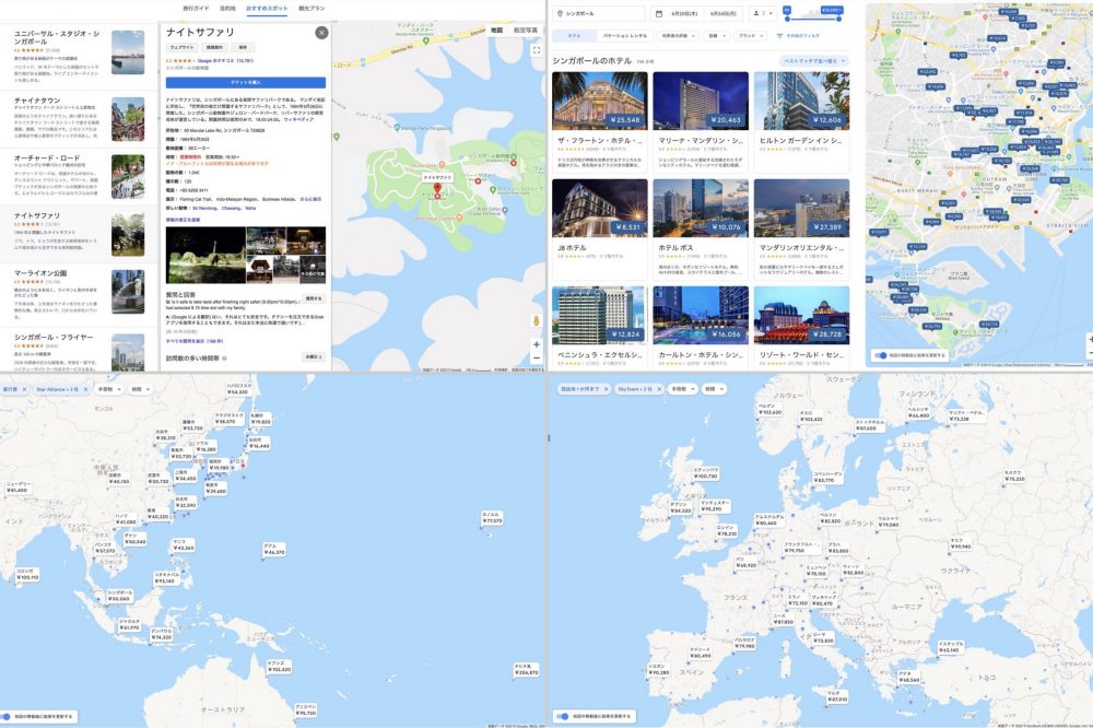
Google's Travel Planning Tool Google Travel The PC version of the service was released, and I personally planned a trip so I tried using it and thought that this is what I wanted!
I’m planning a trip with the new Google Travel (PC version) but it is honestly too convenient.
It's a real-time, updated guidebook with a booking button that allows you to compare the price of your flight while looking at the world map even when you are lost. https://t.co/4bpPQrs5rN pic.twitter.com/r9laYJp4t8 Shota SATO/non-standard world (@shotasato_nsw) On June 5, 2019,
Google Travel is a service that allows you to research and book flights/hotels/tourist spots/restaurants (*reservations are only available at supported facilities).
So, today we will organize the points of UX (User Experience) that provide this service from a designer's perspective.
Contents [ hidden display ]
Content and conductors in line with traveller behavioral scenarios
When you go on a trip, what kind of behavior process do you follow?
In order to organize the points of UX, we will divide traveller’s behavior into four stages and look at our services.
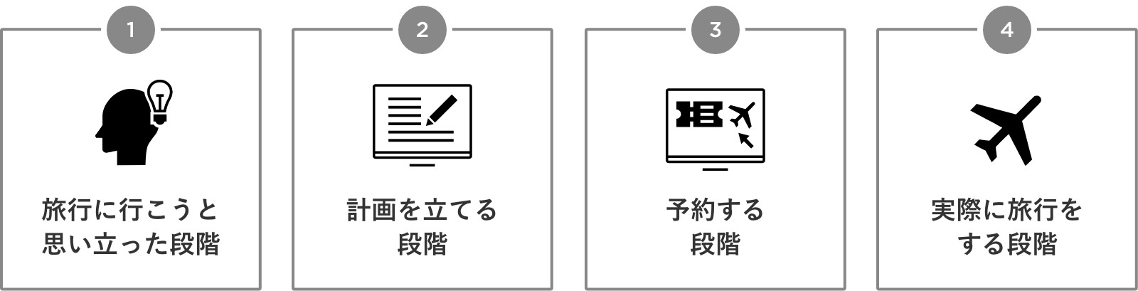
Then we found out that Google Travel has content and lead lines in line with the traveler’s behavioral scenarios, so let us take a look at them one by one.
1) The stage at which I thought about going on a trip
At this stage, there are three possible states:
- the condition of a date being set ahead
- the condition of a destination being set ahead)
- the condition of not having a fixed date or destination (I want to go on a trip vaguely)
With Google Travel, you can start looking at it from any state.
the condition of a date being set ahead
It is a pattern to consider the next destination because there are plans for a group of holidays, and I think "Let's go on a trip" etc.
In this case, by entering a date in Google Travel, the price of a flight to each city is plotted on the map and you can search for a candidate’s destination.
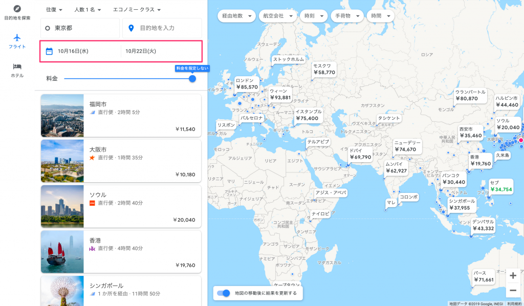
When you enter a date, the price of your flight is displayed on the map.
When you zoom in on a map, you’ll see more detailed destination options that can be used to narrow down direct flights and specify time zones for departure/arrival, as well as a list of rates per airline when you click on the price indicator.
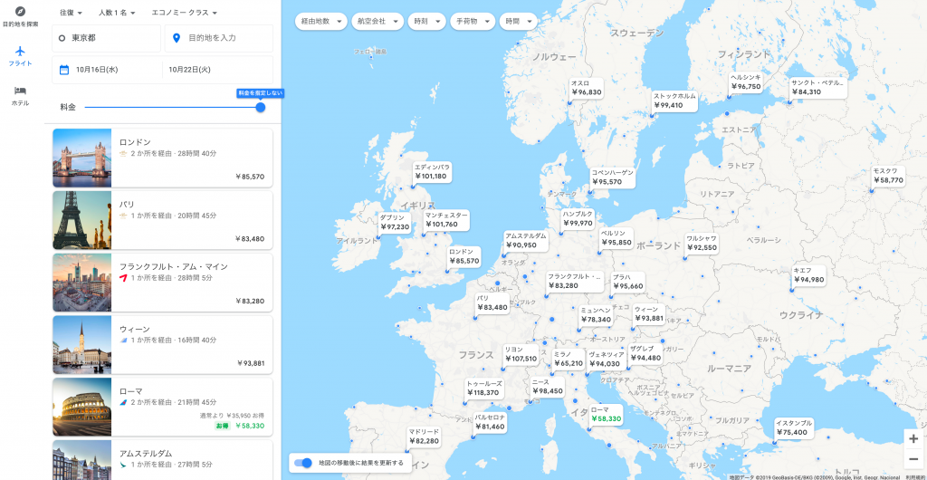
Expand the map to display more detailed destination candidates
Points of Excellent UX Design
- to be able to search for a candidate's location in an undetermined state
- This Intuitive Screen Will Plot Flight Prices On A Map
- Click on the price to see a list of prices per airline, and you can do an intuitive study of details from all over.
the condition of a destination being set ahead)
For example, magazines and SNSs that introduced travel destinations have decided where to go when they say “I want to go here!”
We will consider "when to go" next with a destination.
In this case, in the "Price graph", you can list the "transition" of rates at any number of nights; that is, you can find a cheap date.
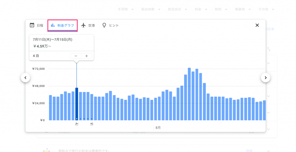
In the "Price graph" you will see the rate transition (you can see how high it is.
In addition, you can also check the combination of outbound and backbound dates that are the cheapest in "dates".
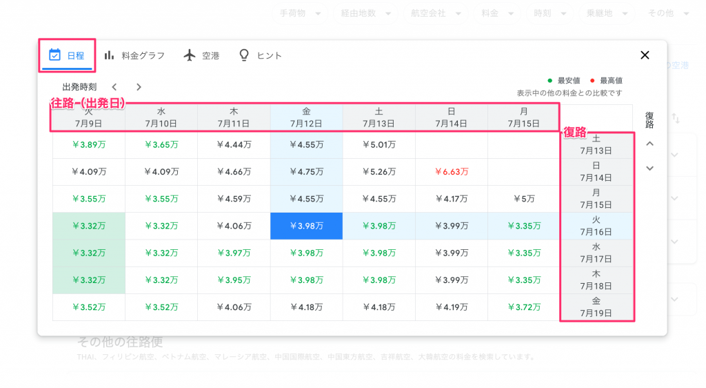
In "Schedule" the grid displays a combination of dates that will be the cheapest.
Points of Excellent UX Design
- You can narrow down the schedule by saying, "It's a fixed destination but not a scheduled one."
- Here’s an intuitive pricing graph to find out when you can go cheaply
- After choosing the time roughly, you can look for a combination of the cheapest outbound and backbound dates from the front page.
the condition of not having a fixed date or destination (I want to go on a trip vaguely)
If you’re not sure when or where to go, but want to travel, you can start looking at the “popular destination” that appears on the top screen.
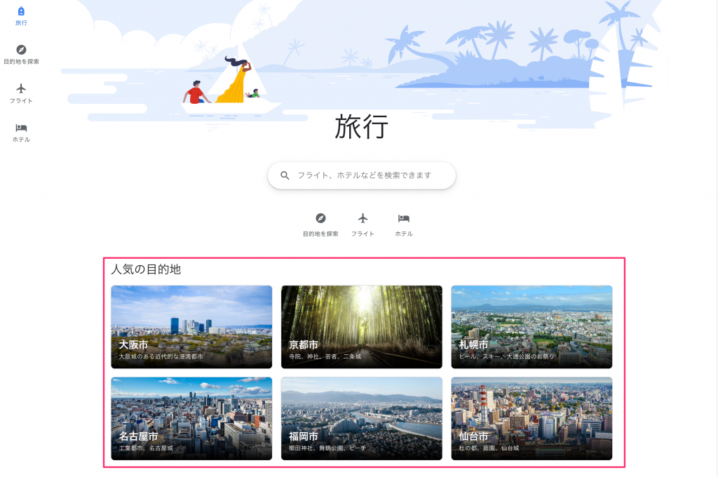
Google Travel Top Screen "Popular Destination"
Popular destinations" seem to vary depending on where you are, and in the US version it is as follows.
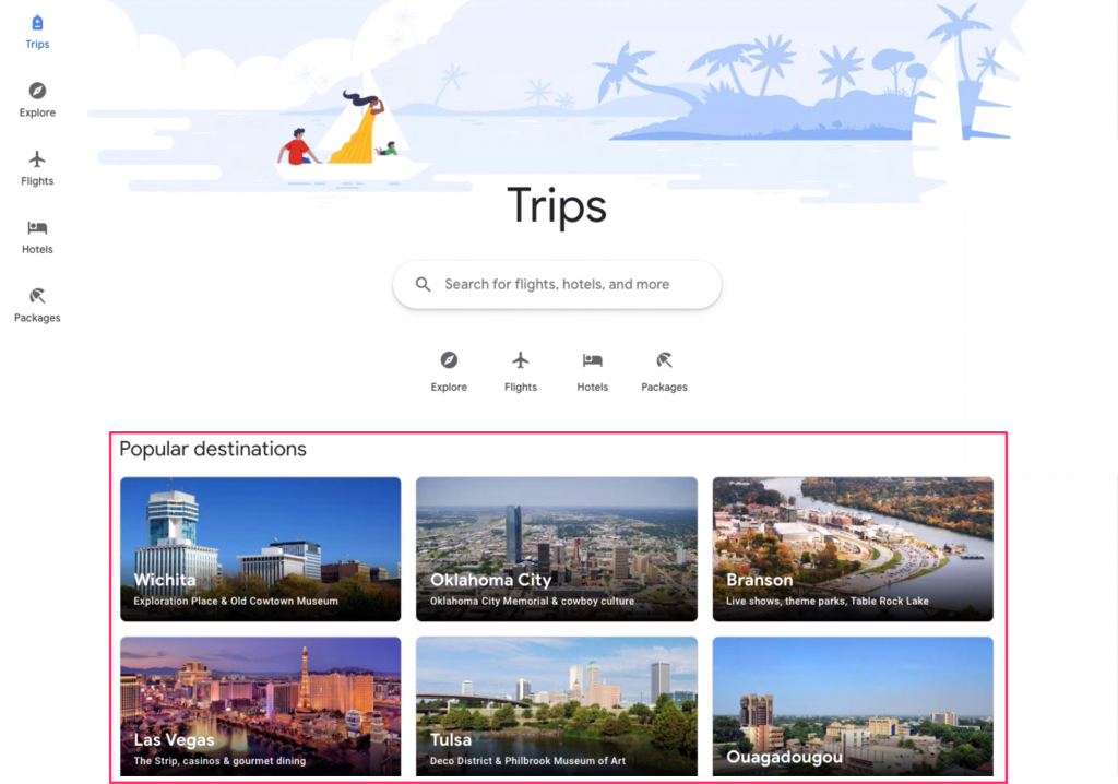
Google Travel Top Screen "popular destination" (US version)
In addition, there is a screen called “package” in the US version. When you enter your departure location, it will be suggested by flight and hotel packages for popular travel destinations; the color of recommendations has become stronger.
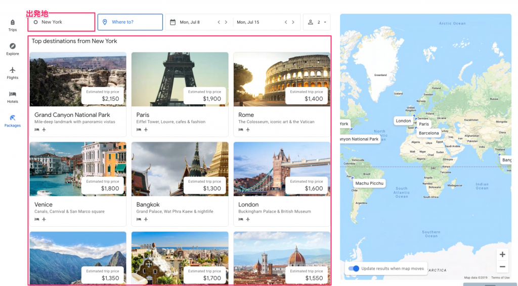
Google Travel US Edition "Package"
Points of Excellent UX Design
- you can start thinking about it in a state where there is no fixed date or destination.
- You will see a popular destination where you are, so you can “select and decide” from the recommendations.
2) The stage of planning
It is a stage to narrow down the schedule and destination.
If you revisit the site over a period of days, you’ll see information about recently searched flights as “checking rates” on the top screen and continue research.
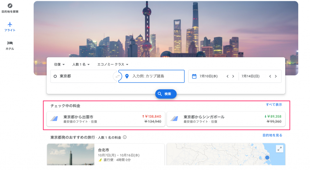
Top screen displayed for users who have searched for flights in the past
You can also receive an email notification when the price is updated for a flight or hotel you are considering, and send a shared link to your companion to consult with us.
Points of Excellent UX Design
- You can continue to research based on the conditions that you looked at last time.
- receive an e-mail notification when the fee is updated
- be able to consult and confirm by sending a shared link to one's companion
3) Reservation stage
It's time to make a reservation, and in the past you had to enter your itinerary every time you booked for a flight or hotel on each site.
However, in Google Travel you can make a reservation without entering your itinerary every time by starting from Google Travel.
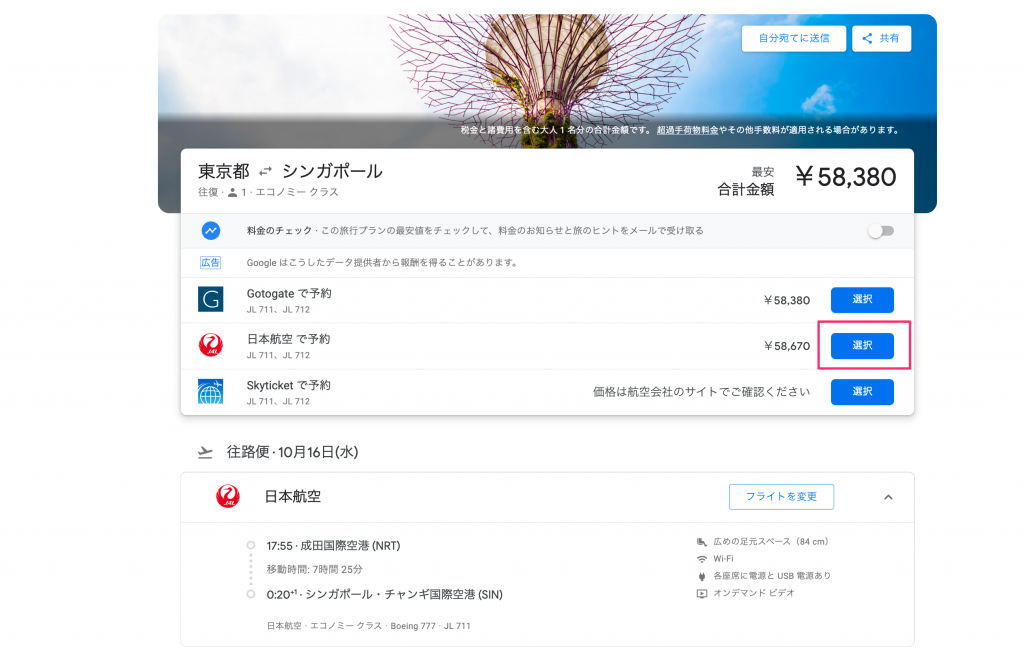
make a reservation from the flight detail screen to supplier's site
In addition, the functions “Book on Google” and “Reserve with Google”, which are offered in some regions, have been completed to make reservations and settlements at hotels and restaurants on Google without leaving external sites, and smooth reservations with fewer screen transitions can be made.
automatic itinerary generation
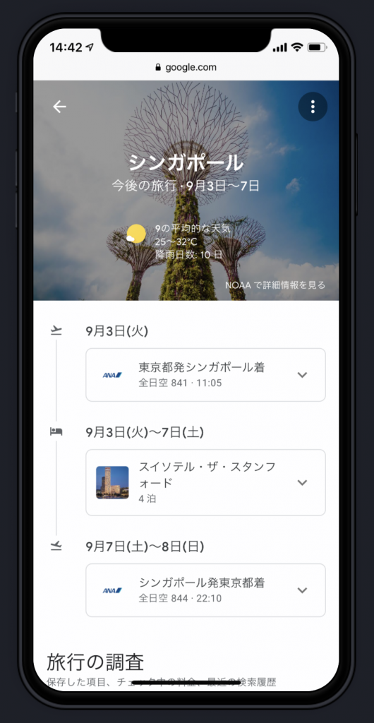
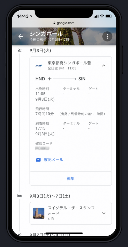
It will automatically create a itinerary if you receive your flight or hotel reservation confirmation email with Gmail address, and future trips will be displayed on the top screen of Google Travel (although there is a lot of debate about automatic generation without prior consent).
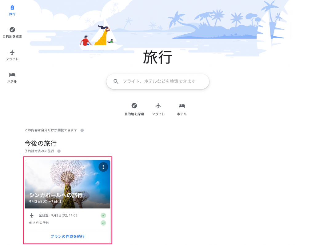
View future trips. Click to view it.
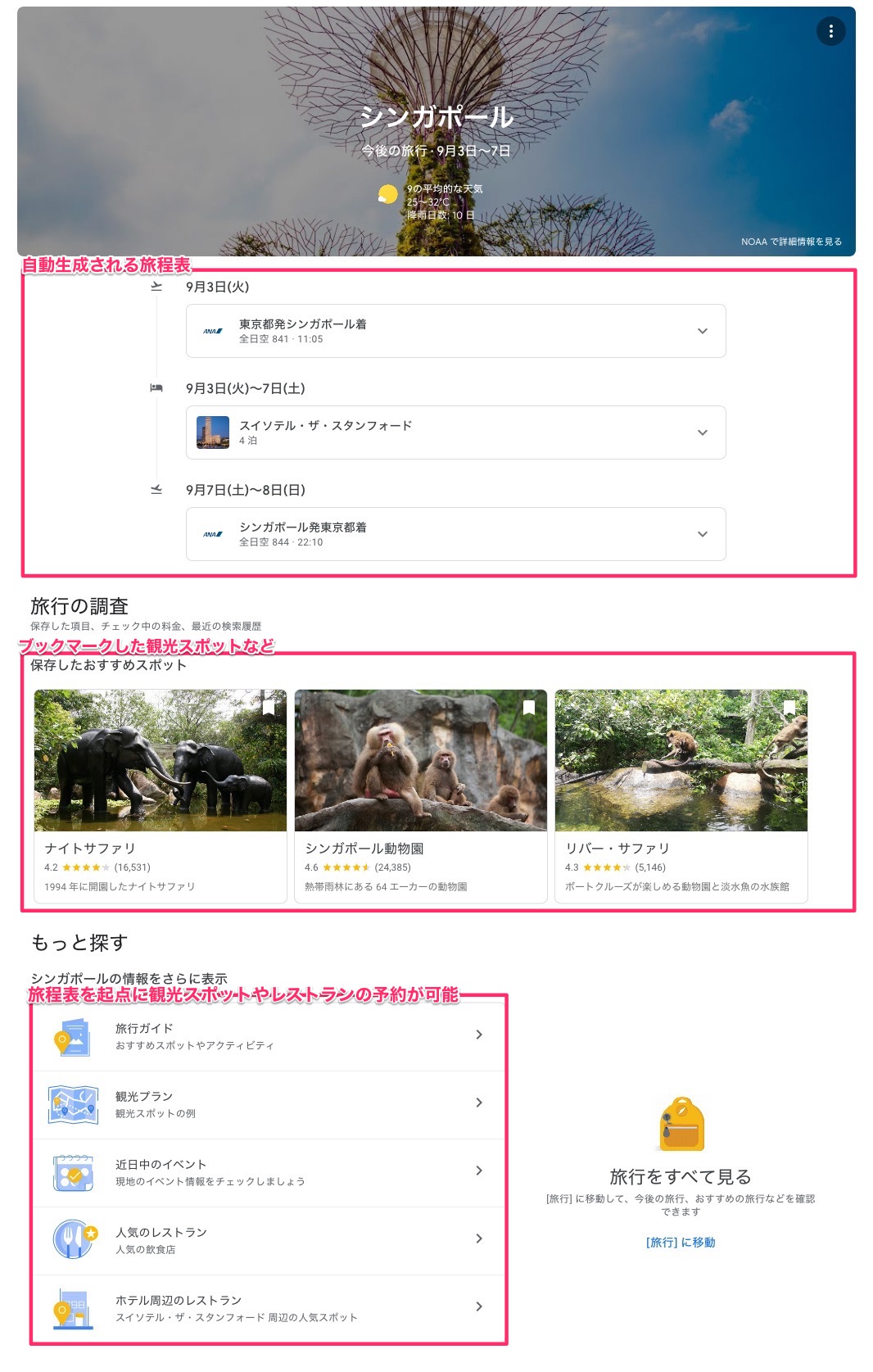
Itinerary table page
By automatically creating a itinerary, you can expect users to revisit this screen and from the itinerary onwards, you will be able to search for/reserve restaurants around your hotel as well as find/reserve sightseeing spots.
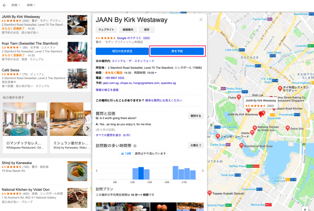
Reservations and Search for Restaurants in the Hotel Area
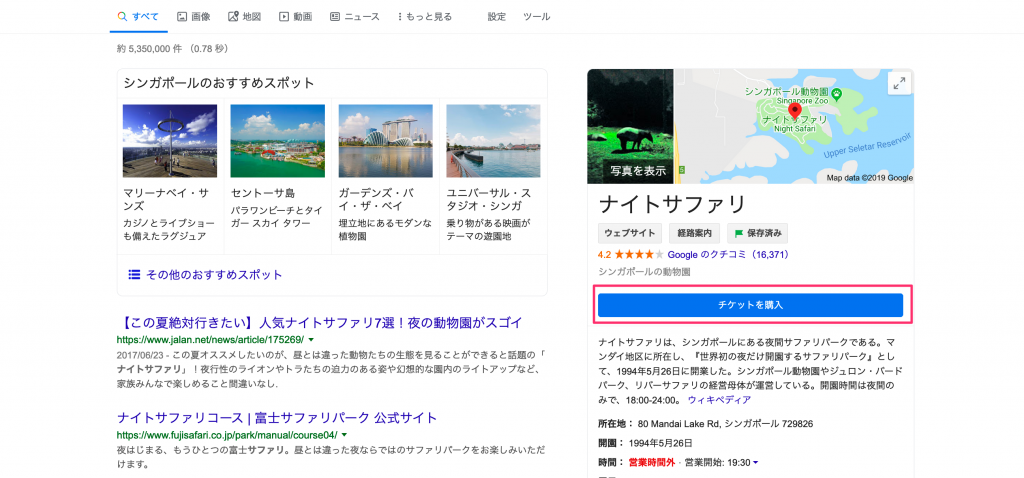
Purchasing tickets for sightseeing spots
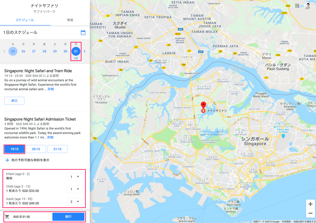
Purchase tickets for tourist attractions (finished on Google Travel)
Points of Excellent UX Design
- you don't have to enter your itinerary every time you book a flight, hotel, etc.
- (In the corresponding areas and facilities) settlements are completed on the site.
- When you make a reservation, your itinerary is created automatically
- From that itinerary, you can search and book sightseeing spots and restaurants.
- or "restaurants around the hotel you stay in."
4) The stage of actual travel
You will be able to access from your smartphone at the destination, including flight information, gate check, and hotel map display, all starting with itinerary tables. Of course, you can also book sightseeing spots or restaurants locally.
Points of Excellent UX Design
- Auto-generated itineraries let you travel with your phone
- The itinerary provides real-time information about flights and other information you need during your trip.
- From the itinerary, you can search and book sightseeing spots and restaurants.
- get real-time information about tourist attractions and restaurants
Google Travel's UX Is a Sad Thing
It’s a very good Google Travel UX, but I also want to write down some of the things that felt sad.
More seamless integration between PC and smartphone versions
McKinsey Survey As noted in Travel shoppers are hopping between devices, many users will be able to access multiple times from both their PC and phone at the "planning" stage. Surely it's rare that they can make all their reservations at once, so you should visit a site several times. If your PC version of your search history is reflected on the smartphone version, then you might get there more smoothly.
a wire that looks for a destination from what you do)
At the stage where I thought about going on a trip, there seems to be another condition that can be assumed: it is the state in which "what you want" is decided first.
For example, if you want to go to an art museum where Picasso works or surf in a famous spot, you need to find a destination from the beginning of what you do, but you can’t find a lead line that looks for candidates from cities around the world.
You can search close to it by using regular Google Search, but if there are such conductors on Google Travel, you think that there is a certain number of users.
Summary
As we've seen, Google Travel has a lot of good UX design points.
There are content and wires that take into account the behavior of travelers, so it is possible to use from the planning stage through to the travel, and I felt that this service will improve the experience for tourists.
When I used to travel with a guidebook, I thought that "traveling with one Google Travel" might become commonplace.
✳︎
However, as an aside, if it is too convenient from information acquisition to reservation and recommendations are further strengthened in the future, there may be a possibility that serendipity which can be said to be one of the attractions of travel, so I personally feel that it is useless :)
I would also like to see how the UX provided by this service will be updated in the future.