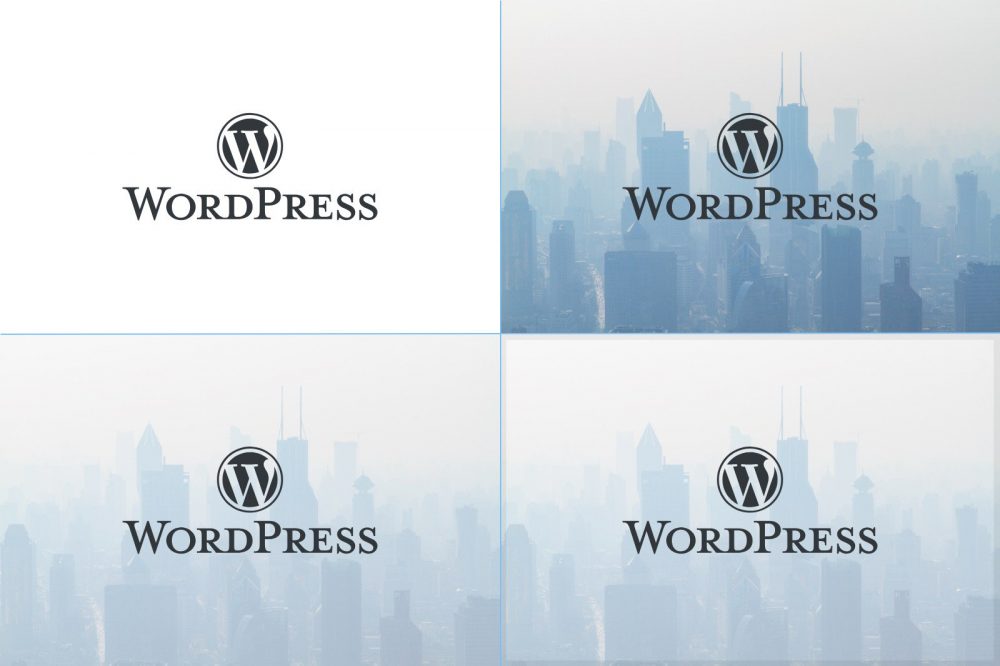
Stand out in the timeline: Tips for creating featured images

Hello, I am Oura of PR CSR.
How do you click “Let’s read” on a social media timeline where massive amounts of information are flowing?
One of the key keys to getting you to stop in your timeline is an eye-catching image, which will determine whether or not to click on it.
We held a study session in the company about “points when making eye-catching images” that many people want to know because there is an opportunity to transmit on the Internet.
It was art director Sato who taught me.
Adobe XD demonstrates how to create simple eye-catching images. In this article, we will introduce our learnings as a whole.
Contents [ hidden display ]
let's find the right material for our theme.
First of all, look for materials that could be used in eye-catching images.
Starting from the theme of article content, we look for materials such as logos and photographs. whether or not we can collectthematically accurate images, If you can get a material that accurately represents the theme, you just need to do minimal processing and editing rather than twisting it weirdly.
The designer is like a sushi chef, and it’s better for the customer to pick them up quickly rather than being kneaded around with good quality items.
Let's search the logo by English information.
If you want to use a logo on the topic of an article, check out Google first.
Since English information is more likely to be search hits, the keyword will be " logo eps" in English.
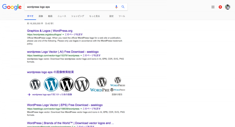
eps is a vector format file that does not coarse even if it is enlarged (aka: path data). The Logo Is Official, Finds Vector Imagery Yes.
By the way, there is a file format called bitmap format for vector format and photos are bitmap form. Since image quality will be coarse when you enlarge it, let's prepare one with as high resolution as possible.
As an example, I assume to write an article about WordPress. The official logo was found as a result of a search "WordPress logo eps", the download file is in PDF format and it can not be opened with XD so once you open it on Illustrator, copy and paste it into XD.
Free Recommended Materials Site
The logo was placed on the white background. It's simple and good, but it's a bit of a touchy experience—you have to look for some kind of material in the background.

Sato recommends that you look for ingredients on the site. Unsplash There are high-quality photos that you can download for free, commercially available, and no credits required,” he said.. As an eye catcher, this is useful when using a highly abstract photo as the background.
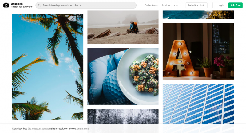
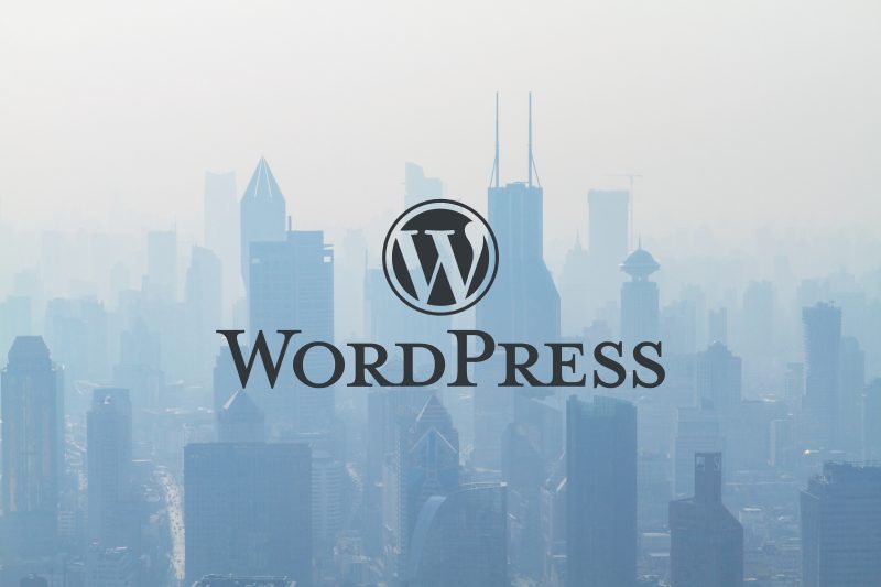
Once you've downloaded the image, drag and drop it to place your photos on XD, which has changed a lot.
Awareness of the "main character" in eye catching
When you overlay a photo with something, it's important to be careful: what is the main character? If you feel that the claim of a photo is strong, lowering transparency will make the main character stand out.
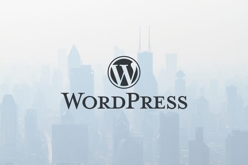
If you’re feeling that there is something a little bit lacking, it can be described in the design world by saying “design density isn’t enough.
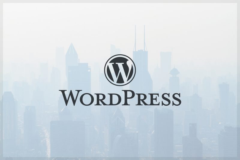
To increase the density, we add some elements but be careful not to smash them as a whole.
This time I pulled the border around, because it is strong in black, and when I lowered transparency, I got used to the whole thing. It made me feel like the image was tightening.
Tips for Choosing Fonts in the absence of Logo
As a material for eye-catching images, there may be no logo and only text information.
At that time, the recommended font etc.will be omitted because it depends on the font contained in each person's PC, but there is a point to choose the font of the heading.
that's "You shouldn't be half-thick." It is easier to see if it's thin or thick enough, because it visually separates from other information.

let's use the symbol effectively.
It is also recommended to use symbols such as Japanese kagikakko and "x" effectively. In doing so, it is recommended to draw lines with a pen tool without typing on the keyboard, and this results in merihari being created by the thickness of the symbols and characters.
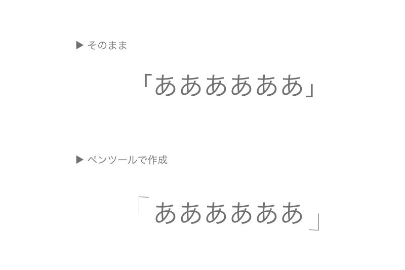
Since there is no correct answer to which one is suitable for horizontal or vertical arrangement of characters, we will try both.
The lecturer Sato says, “It’s better to design an eye-catching image if it has a small amount of information.” In the following example, because you can see differences in the width of characters in the vertical order, it is better to have more visual information about them side by side.


instead
Think about the theme, scrape away what you don’t want and give it order and add accents to it. You may be able to make a difference in your SNS timeline with just a few tips. I hope this article will help you even a little bit.